Cami's Gallery
9th Grade C:
Autobiography Map:
Description:
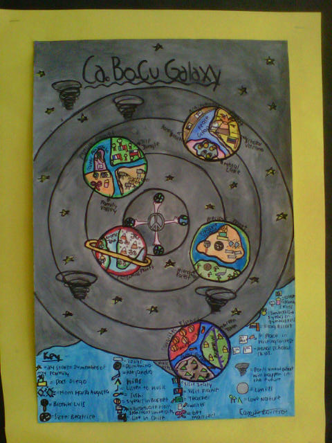
In this projects we had to use different symbols to represent different aspects of our life. We had to do some sort of graphic representation of our life using symbolism to represent experiences from the past, present and future. I chose to make a new galaxy called Ca.Bo.Cu Galaxy. I came out with this name due to my initials. I included five different planets and each one represent different characteristics and important things of my life. In order to make this project I first created a sketch in my notebook with all the things that the final map was going to include and the specific colors for certain things. I also created a Key that said what each symbol meant. Then I got an A3 carboard and drew my galaxy in it using a compass for the orbits and the planets. Then I began painting it using water colors and using the different the painting techniques that we learned in class for different drawings. After coloring the map I realized the key on the bottom with all the symbols and painted them carfully wiih water colors. Then I wrote the title with marker, and passed words and borders with permanet marker so then they were more clear. These are the the most important planets in my map:
Precious Planet:
Here I included a planet with all the things I love in my life. For example, I included a Treasure Island where I drew little symbols representing my family. My dad`s symbol is the birthday cake from his 40th birthday because it was the most beautiful I lived with him. My mom is symbolized with two shiny diamonds because of her beautiful crystalline blue eyes. My brother is represented with a microphone because he likes to give speaches, and my sister with a soccer ball as she loves that sport and is a genius in it. There are also three bones that represent my three dogs. Then there is a Friendship Forest where I included my two best friends Domenica represented with a cookie and Alejandra represented with a gymnastics ribbon.
Achievement Planet:
This is another very important planet because here I represented all the achievements I have accompished in my life. There is the symbol of a paper with a 1st place written in it because it symbolizes that I like to write stories and therefore become a writer when I grow up. Also, it symbolizes that I won the first place in a writing contest with my story called "My Real Father." There is also an Ecuadorian flag that represents that I was a flag escort in the Flag Ceremony in 6th grade. Additionally, there are is the Honor Beach where I included the two honor Scholarships I won in 6th and 7th grade.
Reflection:
I enjoyed very much working on this project because instead writing a borring bibliography in paper as always, I had the opportunity to illustrate my life on a map using symbolism that is something we learned in class. My strenghts in the realizing of the project were that at the beggining I had a pretty clear idea of how I wanted my galaxy to look like, so I had not trouble designing it and including the different symbols for each aspect of my life. Another thing I consider possitive about this project is that because I devided certain things in my life in different planets it was easier for me to organize what aspects where going in which planet so then they could be understood better. However, the weaknesses I faced when realizing this project were when I painted with water colors. It was very difficult me to paint some symbols because they were extremely small and when I painted them it was hard to understand what they were. Therefore I had to be extrmely careful and patient as I had to wait for the paint to dry in order to paint the other symbols. Another weakness was that because I had so much tiny things to paint it took me a lot of time to finish the map and I had to take it home to finish. The improvementes that could be made in my project could be to be more careful with the paint brush and know whic paint brush to use for what things so then the paint doesn´t spill all ove the work. Another improvement could have been to use more of the different techniques of using water colors learned in class to make it look more realistic. Still, I finished this project on time and I felt very proud of my job as I placed lots of effort into it and the symbols were clearly displayed showing my life in a graphic way.
About Me Collage:
Description:
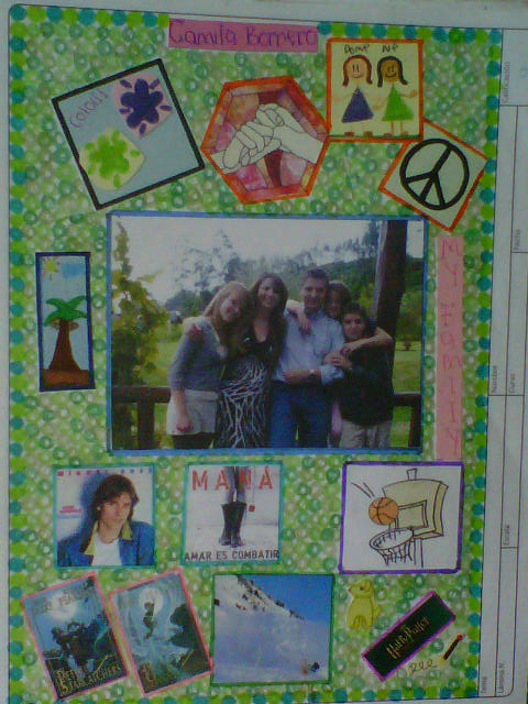
This collage was the first project we made in art this year to introduce ourselves. Therefore, there I included things that identify me as a person. In order to do this project I had to follow a certain process. First, I thought about the most important aspects of my life like: my favorites, values that have helped me learn important lessons, and the most essential people of my life. Then I searched for a picture of my family who are the most important people in my life. This picture was took before my father´s 40th birthday an event that was very important in my life because all the close family and friends came united in my house. Then I went to search for my favorite things. I also have a drawing of my best friends that are and as they are always there for me when I need. Furthermore, I included my favorite sport that is basketball, my favorite animal that are dogs, my favorite singers that are Miguel Bosé and Maná, my favorite book series that is Peter and the Starcathchers and my favorite movies series that is Harry Potter, and the colors that I like the most that are light green and purple. Additionally, I included a drawing of a beach because I had spend beautiful unforgettable moments in Bahía de Caraquez, and a photo of someone snow skiing because that reminds me of my best vacations ever that were when I went to Chile and learned to ski. Also, I included a picture of two holding hands that represent that I am always willing to lend my hand to people who need it. In addition there is a peace symbol because my dream is to see a peaceful world. Finally, I colored the background with green because I love nature. In order to use this collage we had to use three different types of art materials. Therefore, I used pink cardboard, pink, blue, purple and green pens, different tons of green colors, and other different color markers. Then among other materials I used scissors to cut the different pictures and glue to paste them. With all this I could create a visual representation of myself.
Reflection:
After doing this project I felt very proud of myself when I finished it because I could express all the important aspects about myself. I enjoyed very much doing this project because I could arrange the pictures and the colors however I wanted to make it look good. I like very much the contrast of the green background with all the pictures and in general all the colors contrast with the pictures which make the collage look beautiful and organized. Therefore, the easiest thing that I made when realizing the project was to arrange the pictures and drawings on an organized way so then they could be understood completely. Additionally, another easy aspect was to combine the colors to contrast them with the pictures and the all the content of the collage. Still, on the beginning a huge challenge was to choose the things I was going to include here because I had lots of thoughts about myself in my mind and I had to choose the most important ones. It was also difficult for me to find a picture of the whole family, but after searching in many picture albums I found the correct one. Another challenge was to cut the pictures with craftsmanship because I am not really good on cutting straight. However, being very careful I could cut the pictures and cardboards perfect which made my project look organized. Therefore, for the next time what needs to improve is maybe use some different materials that are more challenging such as paint or glitter. In conclusion, I liked very much doing this project because I had the liberty to organize it how I wanted.
Abstract Drawing:
Description:
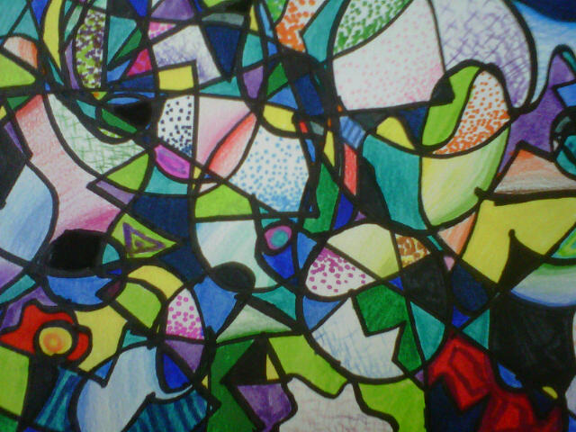
This was the semester exam of the first semester. In order to realize it we had to create different shapes like circles and triangles joined with other shapes of our choice. Then we had to add several curved and wavy lines so then we could create different abstract shapes. After that we had to pass the all the lines with black market to identify the various shapes formed. When we finished passing all the lines we had to erase all the pencil lines left. Also, we had to apply what we learned about value. Therefore, we had to color the shapes formed with the different shading techniques we learned. We had to do a certain number of each shading techniques we learned that were cross hatching, pointillism, gradation/smooth shading, and then make shading from one dark color like green to a lighter color like yellow. Later on, when I achieved all the specifications I could fill the remaining shapes with any color or design I preferred. In order to do this project I used pencil, different colors of markers, color pencils, and a blending stick to make one color lose into the other.
Reflection:
This semester project was an excellent way of expressing what we learned about color value with different shapes. I felt very comfortable with realizing this as a semester project because it was an abstract drawing and with all the colors I used it looks amazing. This project made me understand that art doesn´t always has to have drawings that represent something because we can create art with any shape and color we want and interpret it with our personal opinions. The positive things of making this project were that I could apply the different techniques of shading to color the different forms formed and create an abstract drawing. When I finished the project I was very proud of my work because all the different shapes and color combined looked amazing. The weaknesses that I had when working in this project was to use the gradation technique when going from one dark color to another because I didn´t know how to put them together and make them seem like one of them turns into the other using the blending stick.. I also had a bit of problem when making pointillism because sometimes it didn´t look like the color was getting lighter. The good thing was that I could repeat the different techniques various times and therefore getting better at them each time. In conclusion, this project was a great way of showing what I learned the first semester and all those shading techniques combined together in an abstract drawing make it look amazing.
Camila B. 9C
